About Hero 32
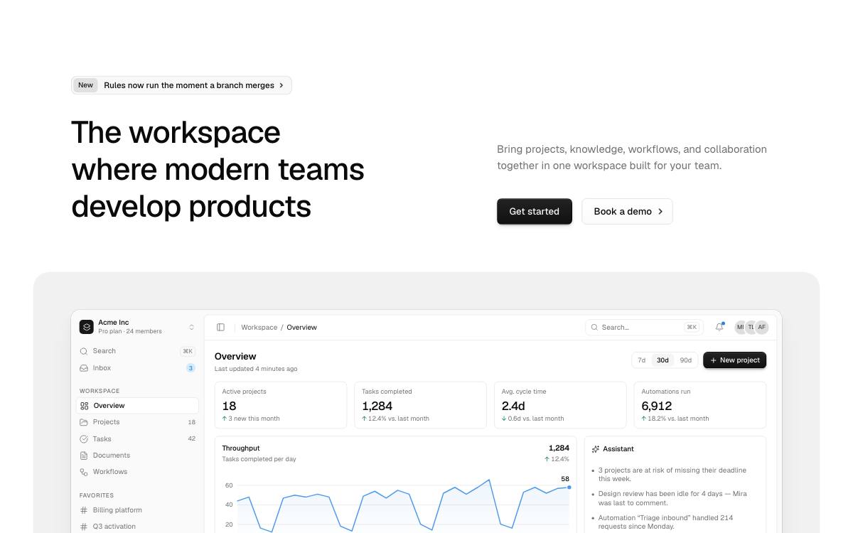
Two columns with an announcement, on a panel: a pill above the headline, the screenshot beneath on a rounded grey panel wider than the page.
Options
- Defaults to
<h1>; passas="h2"under another block's headline. - Point the announcement's
hrefat its page;announcementsets its prefix: badge, label or version. - Pass your screenshot to
media, andframe={{ fade: true }}to fade its foot. sectionsets its rhythm, width and colour scheme.buttonstakes Button Set's options.
More Hero blocks
- Hero 33
Two columns with a logo strip, on a panel: scrolling customer logos under the pair, the screenshot beneath on a rounded grey panel.
- Hero 34
Side by side, on a panel: the screenshot on a tall rounded grey panel filling the other half, running off its edge and fading. Sized to fill the viewport.
- Hero 35
Side by side with an announcement, on a panel: a pill above the headline, the screenshot on a tall rounded grey panel beside it. Sized to fill the viewport.
- Hero 36
Side by side with a logo strip, on a panel: logos scrolling under the buttons, the screenshot on a tall rounded grey panel beside them. Sized to fill the viewport.
- Hero 37
Rising, on a panel: headline at the top of the screen, the screenshot on a rounded grey panel rising beside the buttons. Sized to fill the viewport.
- Hero 38
Rising with an announcement, on a panel: a pill above the headline, the screenshot on a rounded grey panel rising beside the buttons.