About Features 02
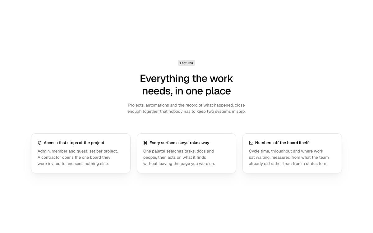
Three columns, carded: the same icon, title and copy on a flat card with a hairline edge and a soft shadow, for a row that needs to read as separate panels.
Options
- Defaults to
<h1>. - Pass
as="h2"when a hero or another block already owns the page's heading; the feature titles follow one level down. - Rhythm, width and colour scheme come from
SectionandContainerthroughsection, never set on the block. headingssets how each card's text is drawn.
More Features blocks
- Features 03
Four columns, carded: a narrower card in a row of four, two up on a tablet and four across on a wide screen.
- Features 04
Side by side: the header and a stack of run-in features on the left, an image or product screenshot on the right. A split row rather than a grid of cards.
- Features 01
Three columns: an icon, a title and a line of copy per feature, straight on the page under a centred header, with no card around them.